
Pantone declared “Living Coral” the company’s Color of the Year. By no means a wallflower, this bright hue is described as “an animated, life-affirming shade of orange, with golden undertones.” Love it or not, Living Coral is about to be everywhere in 2019.
So, how does Pantone go about picking their Color of the Year?
How Pantone Picks Its Color of the Year
Once a commercial painting company, Pantone is now the veritable voice on color. Each March or April, the Pantone Color Institute’s designers, trend forecasters, and colorists take a look at current events through the filter of their vast foundational knowledge on consumer color preferences. Other influences they consider are big-name branding efforts, film, and design trends. Even lifestyle trends and socio-economic conditions are factored into Pantone’s annual pick.
While we were surprised to learn that Pantone’s approach to picking a Color of the Year relies more on professional instinct (with a dash of imagination) than today’s data-driven approaches, there’s something charming about their qualitative process.
It’s with one eye on present-day cultural moods and the other towards the future, Pantone’s in-house teams try to find a shade that matches what’s just around the corner for our collective consciousness.
Why Living Coral Won Color of the Year in 2019
Whether a prediction or positive affirmation, Pantone picked Living Coral for its ability to inspire carefree happiness. A “symbol of our innate need for optimism and joyful pursuits” that resonates across cultures.
Living Coral packs a punch, Pantone’s attitude is far more easy-breezy. “It’s a novel suggestion rather than a do-or-die style edict,” says Laurie Pressman, Vice President of the Pantone Color Institute. “This is just a color we see happening. If this is something that can be inspiring to you, great. But if not, don’t use it.”
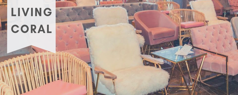
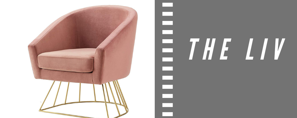
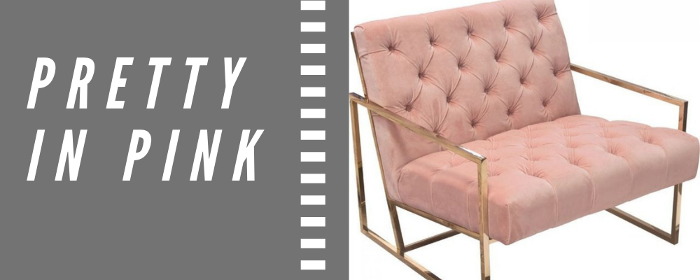
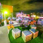
How to Use Living Coral at Your 2019 Event
Leave the guesswork up to Pantone’s professionals! Because Living Coral isn’t exactly a fainting wallflower, designers might find it’s not right for every space. However, tone it down to a slightly softer shade and it’s the kind of color you could use for bright pops of color or across an entire event. Check out these FWR Rental Haus options within the Living Coral color family that are on-trend without distracting from your brand.
See something that you like? Click an image to locate each product’s page, then select the heart icon to receive a rental quote for your next conference, party, or event!


